Penghao Zhu
CONTEXT
Client:
CUNY Mapping Service, Center for Urban Research
TEAM
Penghao Zhu (Me)
Radhika Phansalkar
Manjot Kaur
Kacey Xu
Ivory Zhao
MY ROLE
User Research
Moderated usability testing
UX/UI Design
3D Design
TOOLS
Figma
FigJam
Google Form
Cinema 4D
Spline
Background
Long Island Zoning Atlas Information
The Long Island Zoning Atlas is an online interactive map platform showcasing zoning patterns and comprehensive details about residential housing legislation across Long Island, New York. Developed by the CUNY Mapping Service, the map aims to visualize zoning data to support research endeavors and assist local businesses.
What is the Client’s Goal?
Following its initial launch in 2023, the CUNY Mapping Service aimed to expand the website’s target user base and applications. The objective is to enhance how information is presented, ensuring it is intuitive not only for researchers focusing on zoning and housing data but also for individuals with a general interest in zoning information.
Our Methodology
Conducted 15 usability tests with a combination of professional and non-professional users who knows GIS map. Analysis of resulting data from testing to derive insights, and come up with insights and recommendations.
User Research
Initial Findings
While gathering test participants, our team also collaborated internally to analyze and discuss the user flow of the client’s website and its current issues.
Main User Flow


The content is too heavy with text and information.


Too hard for non-professional users to use.
Moderated Usability Testing
To gain insight into users' perceptions of the usability of the Long Island Zoning Atlas, their behavior patterns, and their overall impressions of the website. We conducted 15 moderated usability tests, with 8 Professionals and 7 Non-Professionals to meet our client's goal of not only evaluate the usability of the website of existing core users, such as researchers from GIS map fields but also to improve the outreach of the map to attract casual users who are interested in zoning, such as housing advocates, journalists or students in related fields.

What did we focus on?
Based on the client’s objectives, we established distinct research goals and questions for two separate user groups:
For professional users, our focus was to understand their main purpose for using the zoning map and whether they could efficiently locate the data they needed.
For non-professional users, we concentrated on assessing the map’s overall learnability—whether they could easily grasp how to use it and if the provided information was valuable to them.
For all participants, we asked follow-up questions to gather qualitative insights about their overall impression of the website.

What did we find?
Professional users embrace the map, non-professionals left behind.
We observed surprising results that revealed starkly contrasting attitudes between the two user groups toward the map. All professional participants expressed highly positive feedback, noting that the information was helpful and the navigation straightforward.
On the other hand, non-professionals found the map overly complex and overwhelming. They also highlighted pain points that diverged in various directions.
To analyze these insights, I collaborated with the team to facilitate an affinity mapping workshop. We organized all the collected data into categories and prioritized three key findings.

Three Main Findings
92% users closed the pop up immediately.
Users do not realize the pop-up guide is a part of the website and do not use it.
It’s important for the users to know the from who the website is generated by.
Without the reference of the map and its features, users find it difficult to understand the use cases on the pop-up guide.
80% users found it difficult to discover information they need.
Map layers can be overwhelming, especially for non-professionals who need help understanding the technical terms.
After selecting an area, participants find it hard to read through the zoning information due to the compact layout.
Professional participants expressed their need in downloading map images and zoning data.
Massive Silence : No feedback, No reach-outs.
1. Insufficient visibility of the date and sources of the current data for credibility of information.
2. The website contact information is not clearly discoverable by professional users.
Ideation
Brainstorming
How might we design Long Island Zoning Atlas 2 to meet the needs of both professionals and non-professionals?
Our Scope
The team held a brainstorming session to determine the scope of the final design. Based on user research, our redesign efforts focus on the most problematic pages: the pop-up page and the main map page.

Make the pop up more discoverable and engaging.
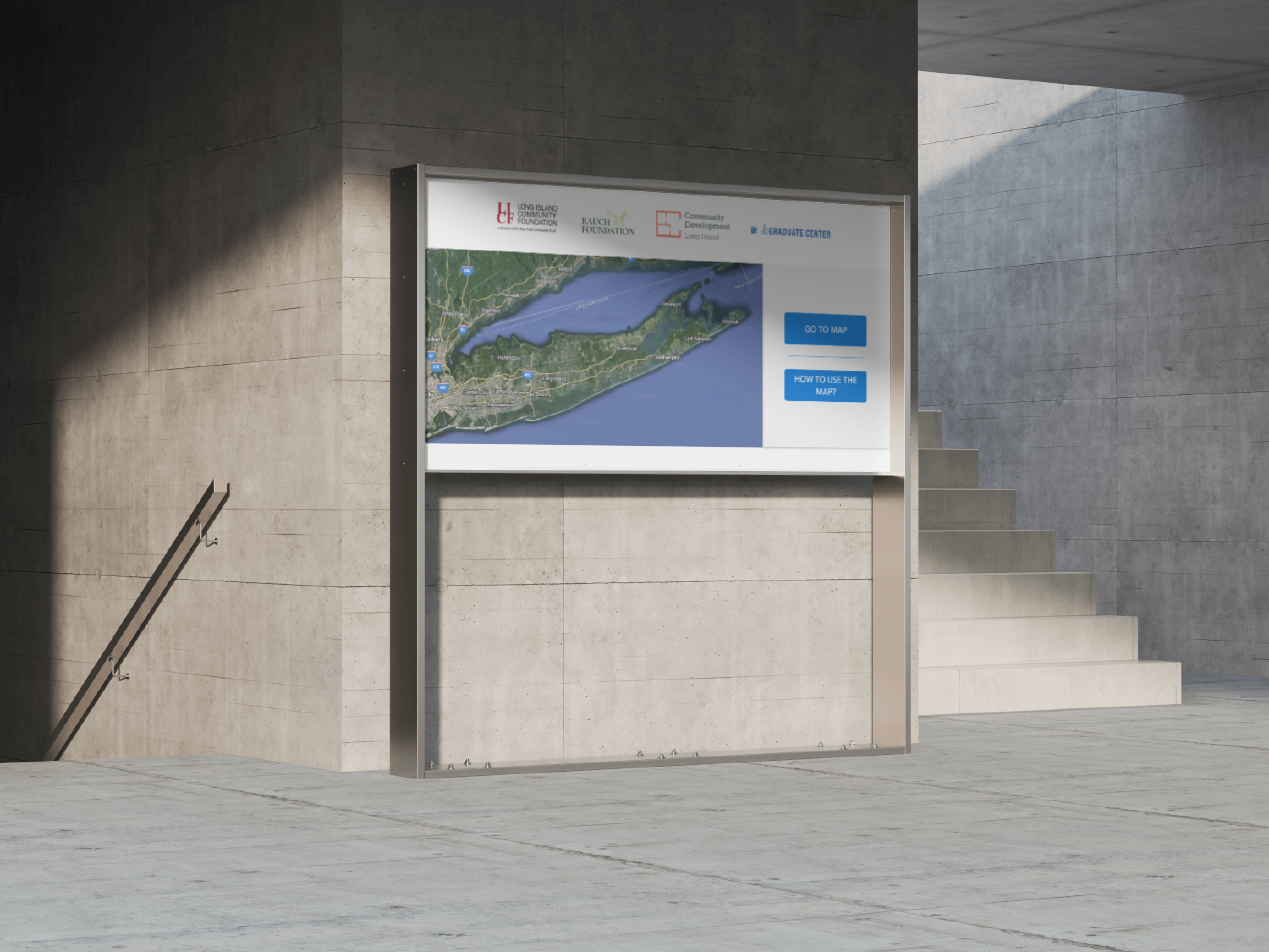
We opted to redesign the pop-up as a brand-new landing page that reflects the Long Island Zoning Atlas branding and offers users the choice to either navigate the map or access a tutorial for guidance.
Reorganize information hierarchy of the map.
For the map page, our goal is to restructure the overall hierarchy to emphasize the most critical content, ensuring it effectively serves the needs of both professional and non-professional users.


Make a floating icon to make the contact more discoverable.
We proposed an AI-powered chatbot that acts as a go-to resource for users to ask questions about map tutorials and terminology explanations. Additionally, it functions as a channel for gathering user feedback.
Final Design
01 Solution
Pop Up Guide and Credibility Answered by the Landing Page
Create a Landing page which will guide users to the functions and important information of the Zoning Atlas.
02 Solution
Streamlined Information Hierarchy and Map Interface
Build a visible and clear interactive structure for the map by focusing on prioritization of information that users need.
03 Solution
AI Optimizes Data Search and Data Collection
Introduce LI Bot - an efficient way for users to get AI powered zoning data and statement.
Bouns Recommendation
3D View Building GIS Map
We recommend that in the future, a 3D map would be more efficient for user to search and use.

Impact
Most of our Recommendations are implemented by the Client.
We set up a second round of usability testing with five previous participants to collect their feedback to our redesign. All three design recommendations were well-received, achieving a user satisfaction score of 4.8 out of 5. Both our findings and recommendations were positively received by the client and are now in the process of being implemented.
"I am glad to see the introductions of the mapping system in the landing page. And I have the option to open How to use the Map in a new tab. It's much clearer than the pop-up."
“I love the “LI Bot”, the avatar is so cute! It is easy for me to find anything I want as a new user.”
“I really like that you split different type of content into sections, and now I can clearly tell how to adjust layers and what to expect for the zoning information.”
“I am glad that I can open How to use the Map in new tab without disturbing my map.“
"The students did a great job! They understood the project well. They solicited very helpful feedback from users (a mix of professionals and non-professionals). They synthesized everything into a cogent analysis. And they went further than I expected in developing working mock-ups to show how we could implement their suggested improvements."
— From the client
Takeaways
Most of our Recommendations are implemented by the Client.
Collaborate closely with clients to ensure success
This project highlighted the importance of consistent collaboration with clients. Regular meetings, email check-ins, and feedback sessions at key stages ensured our work aligned with the client's goals and fostered mutual trust. Beyond meeting the brief, presenting innovative ideas helped create extra value and opened up new opportunities for exploration.
Keep the scope focused
As a newcomer to zoning maps, I initially felt overwhelmed by technical details. However, I learned that success didn’t require becoming a domain expert. Instead, focusing on user needs and navigation behaviors allowed us to deliver impact within a clearly defined scope. A targeted approach ensured effectiveness and efficiency throughout the project.
Enhance presentation skills
Presenting to clients taught me the value of clear, concise communication. I practiced simplifying complex findings and using visuals to tell a compelling story. This not only helped stakeholders understand our work but also strengthened trust and collaboration.
You may also be interested in…


Mood XR-(Coming Soon)
Browse dozens of professionally designed templates. Click, duplicate, customize.
UX/UI Design