View the full project details on the desktop version
Long Island Zoning Atlas 2.0
Redesigning Civic Data into Intuitive Interactive Maps
Background
My Role
In the Long Island Zoning Atlas 2.0 project, I led the end-to-end redesign of the interactive mapping platform. From initial user research and mapping core workflows to prototyping and usability testing, I drove progress at every stage. My focus was to enhance usability for both public and professional users. By redesigning key user flows, creating wireframes, and leading usability testing, I uncovered fundamental pain points and opportunities for improvement.
In the following sections, I’ll share my design approach and the outcomes in detail.
Client
Client: CUNY Mapping Service
Timeline
Mar - May 2024
Team
Penghao Zhu, Kacey Xu, Ivory Zhao, Manjot Kaur, R.Phan
Tools
Figma, FigJam, Google Form, Photoshop
Introduction
The Long Island Zoning Atlas is an interactive web platform that visualizes zoning patterns and residential housing laws across Long Island, New York. Developed with the CUNY Mapping Service, it makes complex zoning data accessible for research and local business use.
Client Goal
After the initial 2023 launch, the CUNY Mapping Service set out to broaden the audience and use cases for Long Island Zoning Atlas 2.0. The goal was to make zoning information intuitive and accessible for both industry professionals and the general public.
Target Users
The platform serves two core user groups:
Industry professionals (urban planners, policymakers, developers) seeking comprehensive zoning and housing data.
General public interested in exploring zoning regulations and neighborhood information.
Problem Statement
Existing zoning platforms are complex and unintuitive, making it difficult for both professionals and the public to find, interpret, and act on zoning data.
Key challenges included information overload, unclear navigation, and limited accessibility—all of which hindered effective data use and broader engagement.
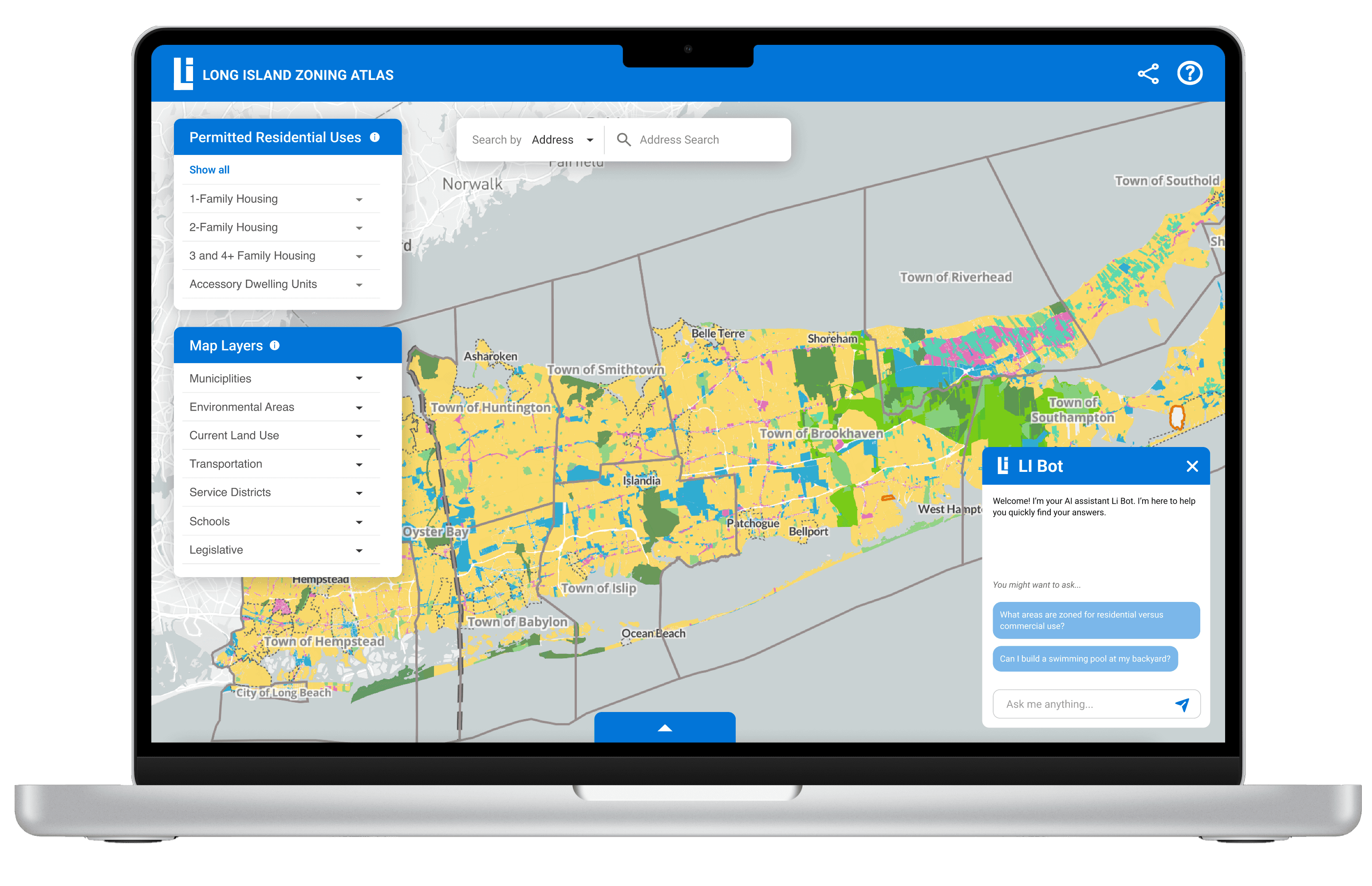
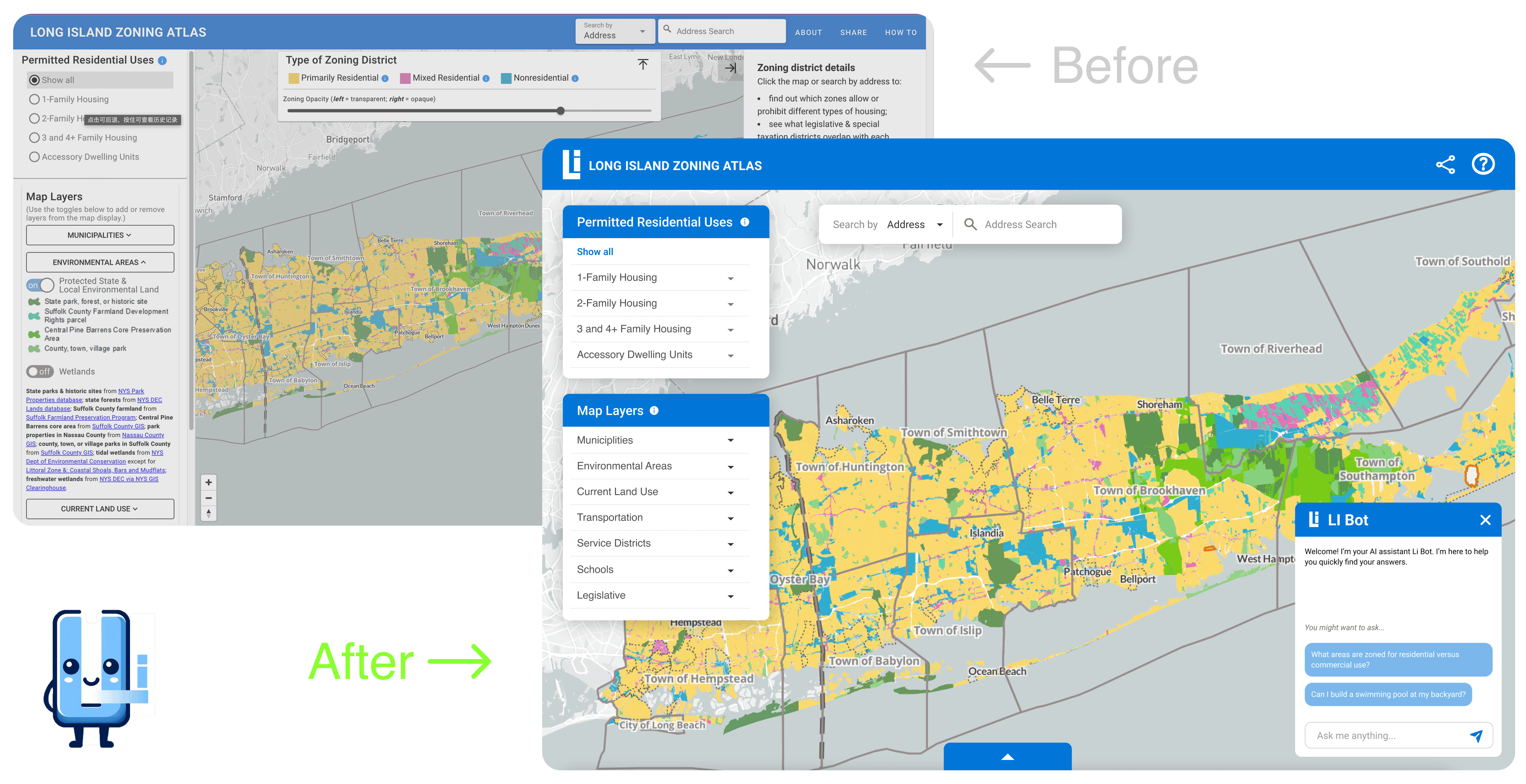
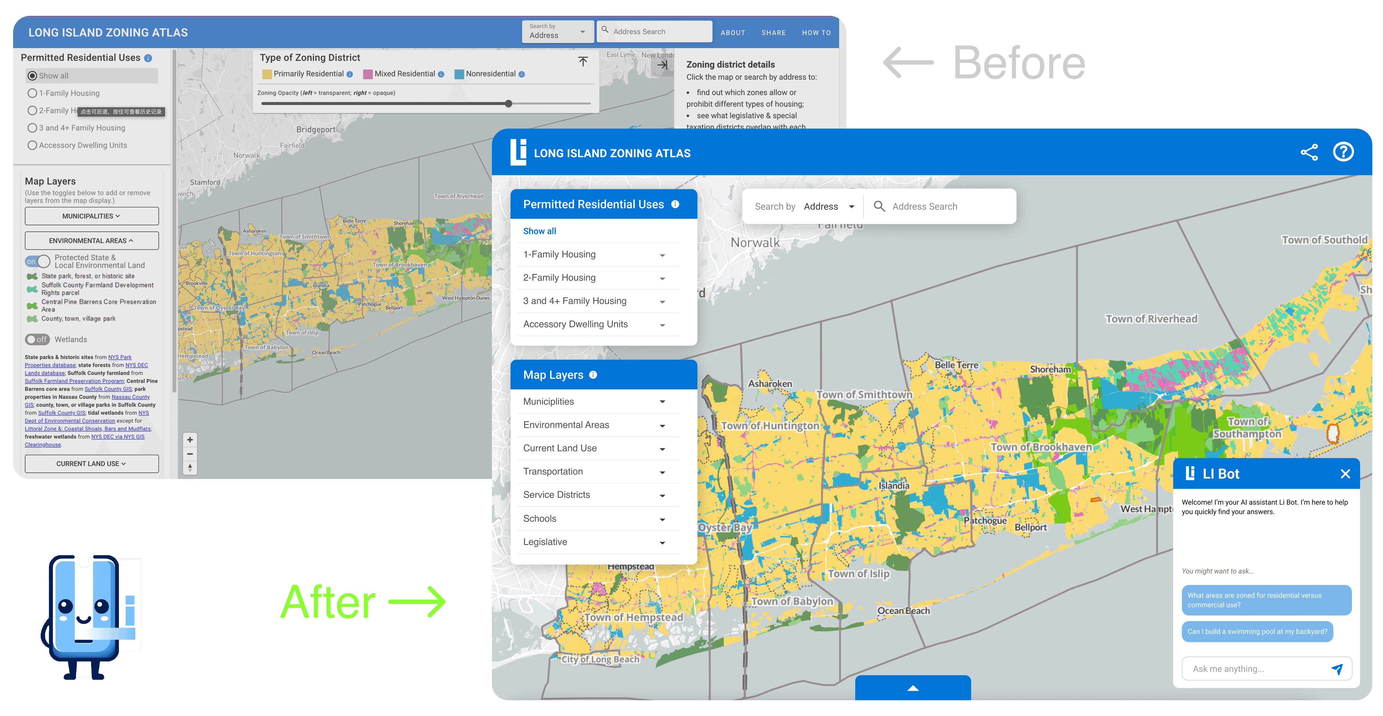
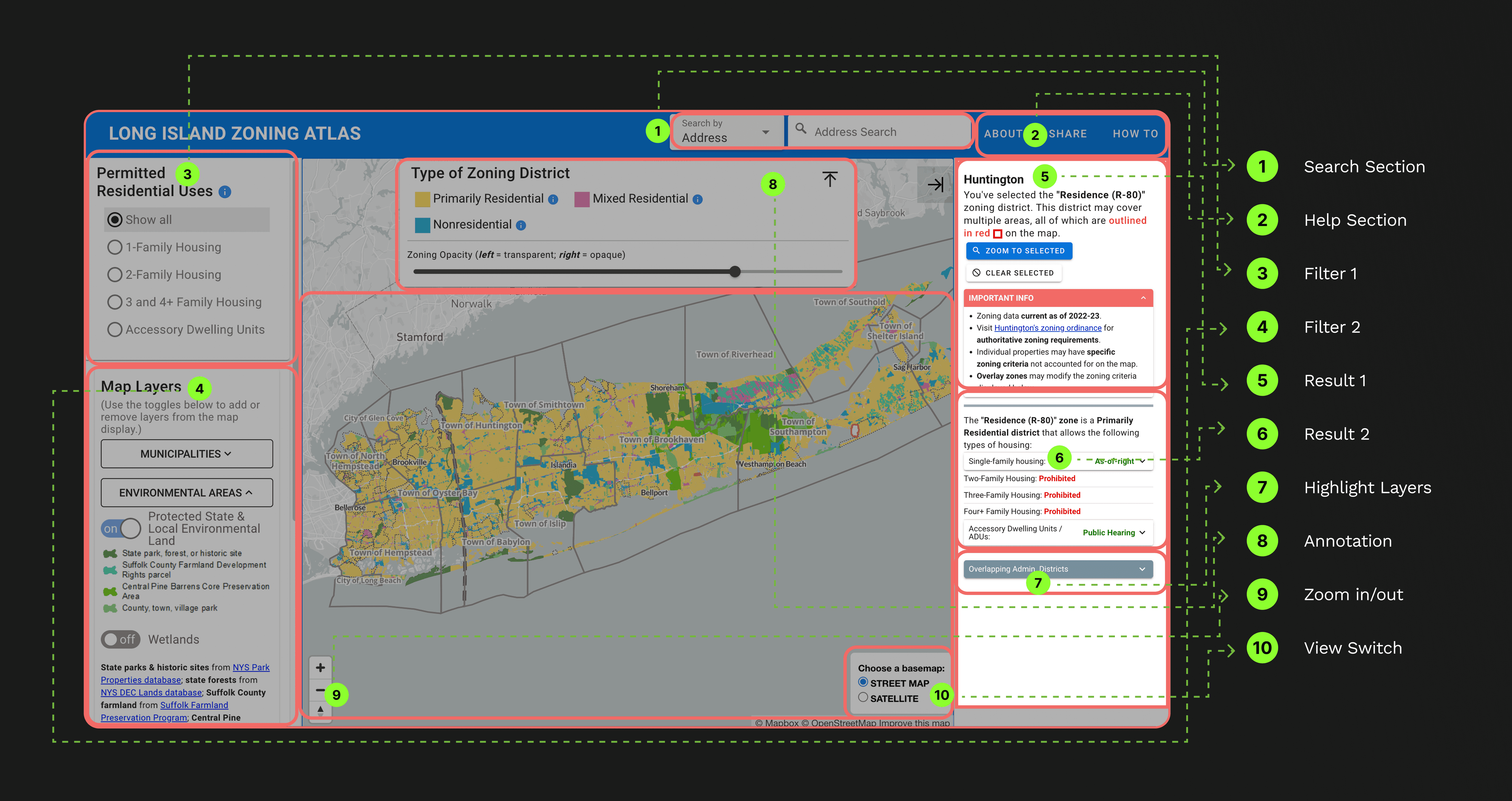
Design & Prototype
Before & After

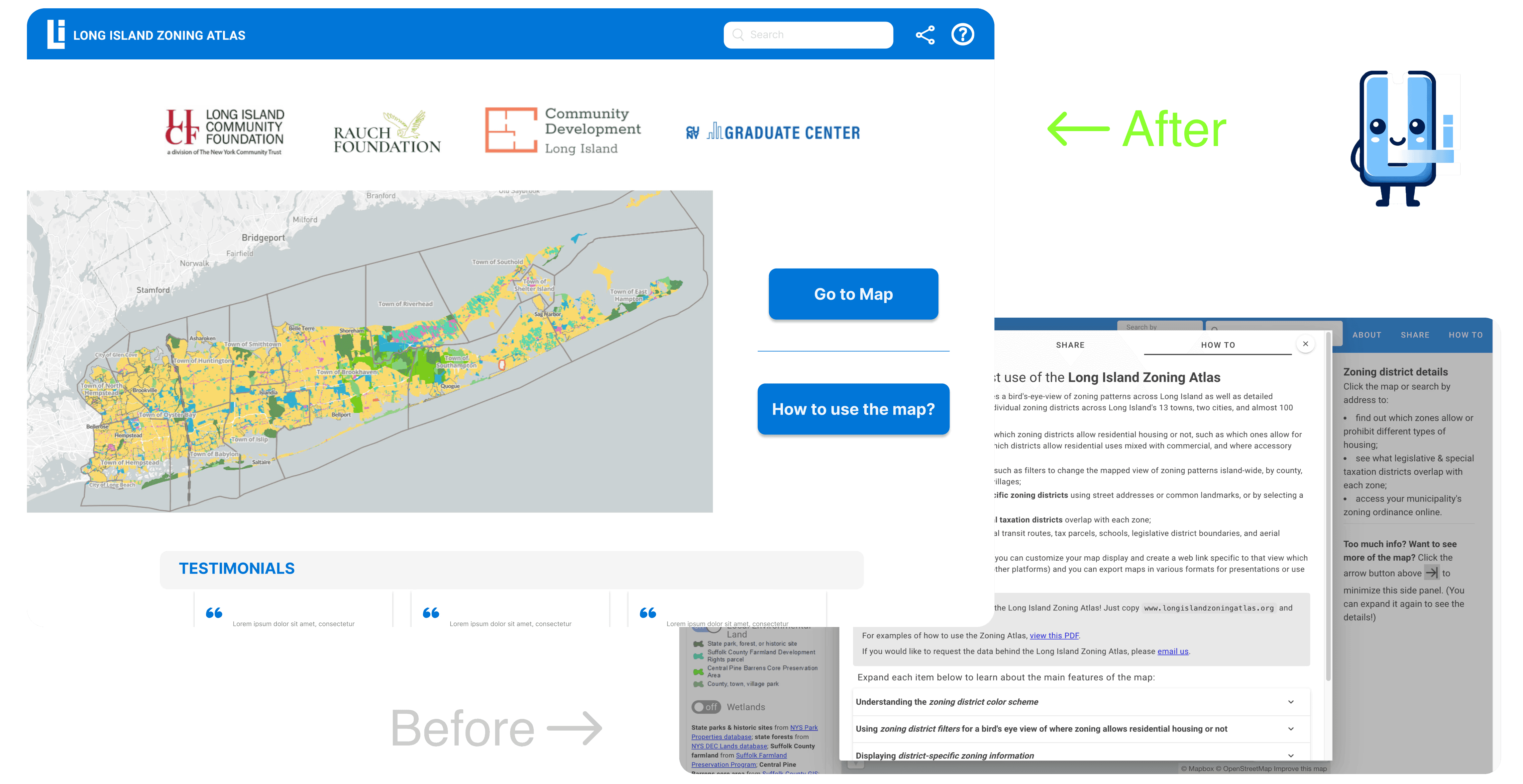
Problem 1
Information Overload:
92% of users closed the text-heavy pop-up immediately, regardless of background—highlighting that the entry experience was overwhelming and not actionable.
Solution 1
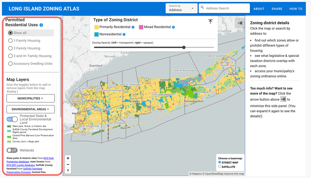
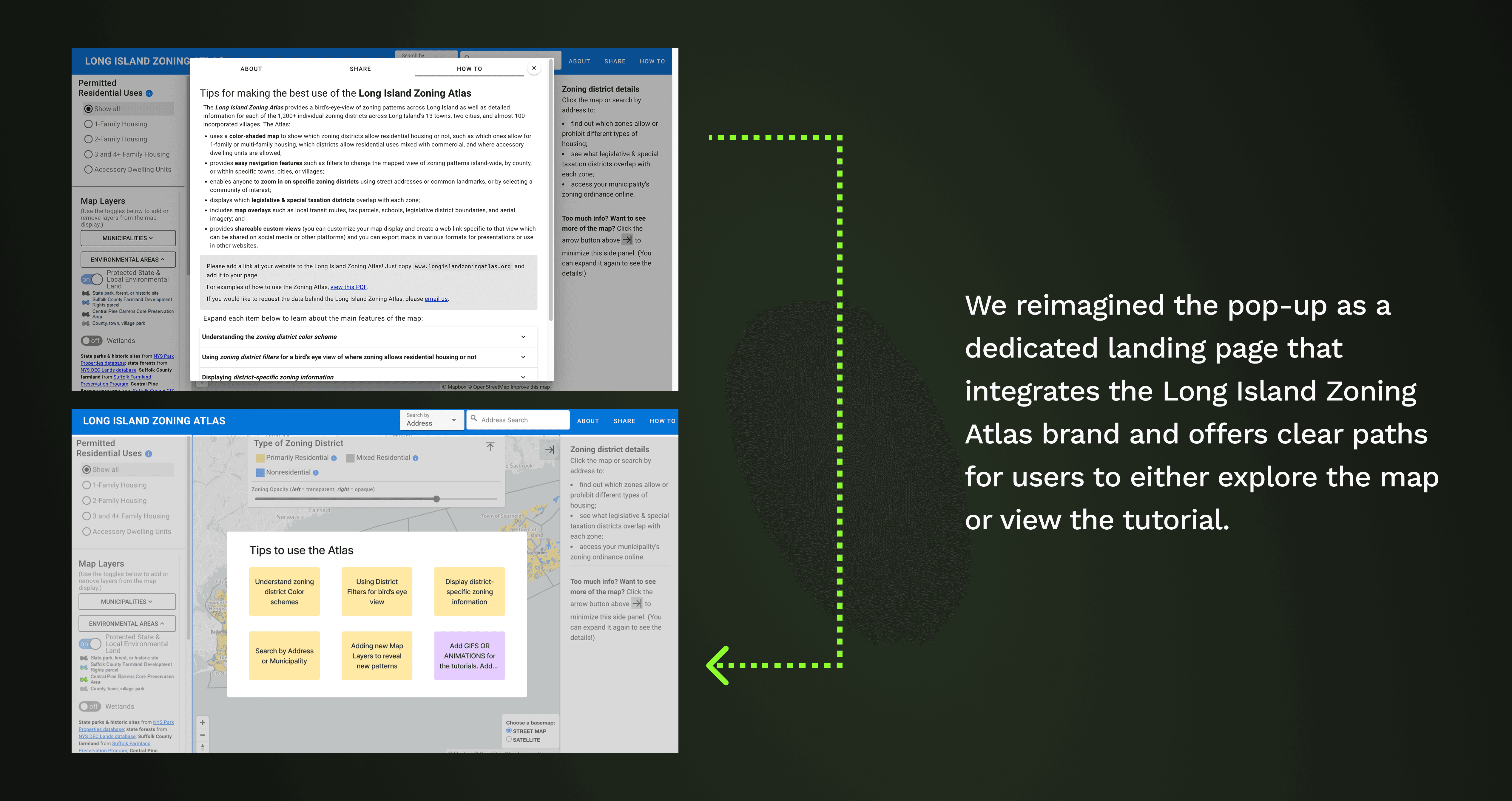
Replace pop-up with a structured landing page:
Introduced a visually clear landing page with concise instructions, reducing cognitive load and building trust.
Added clear CTAs so users can either explore the map directly or access step-by-step guidance—making the entry experience more welcoming and effective.
Problem 2
Unclear Workflows and Overly Complex Interface:
Key tasks, such as finding zoning regulations or using map tools, were difficult to complete without prior experience.
The interface was cluttered and unintuitive, making it hard to distinguish functions or efficiently navigate the platform.
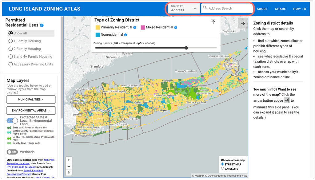
Solution 2
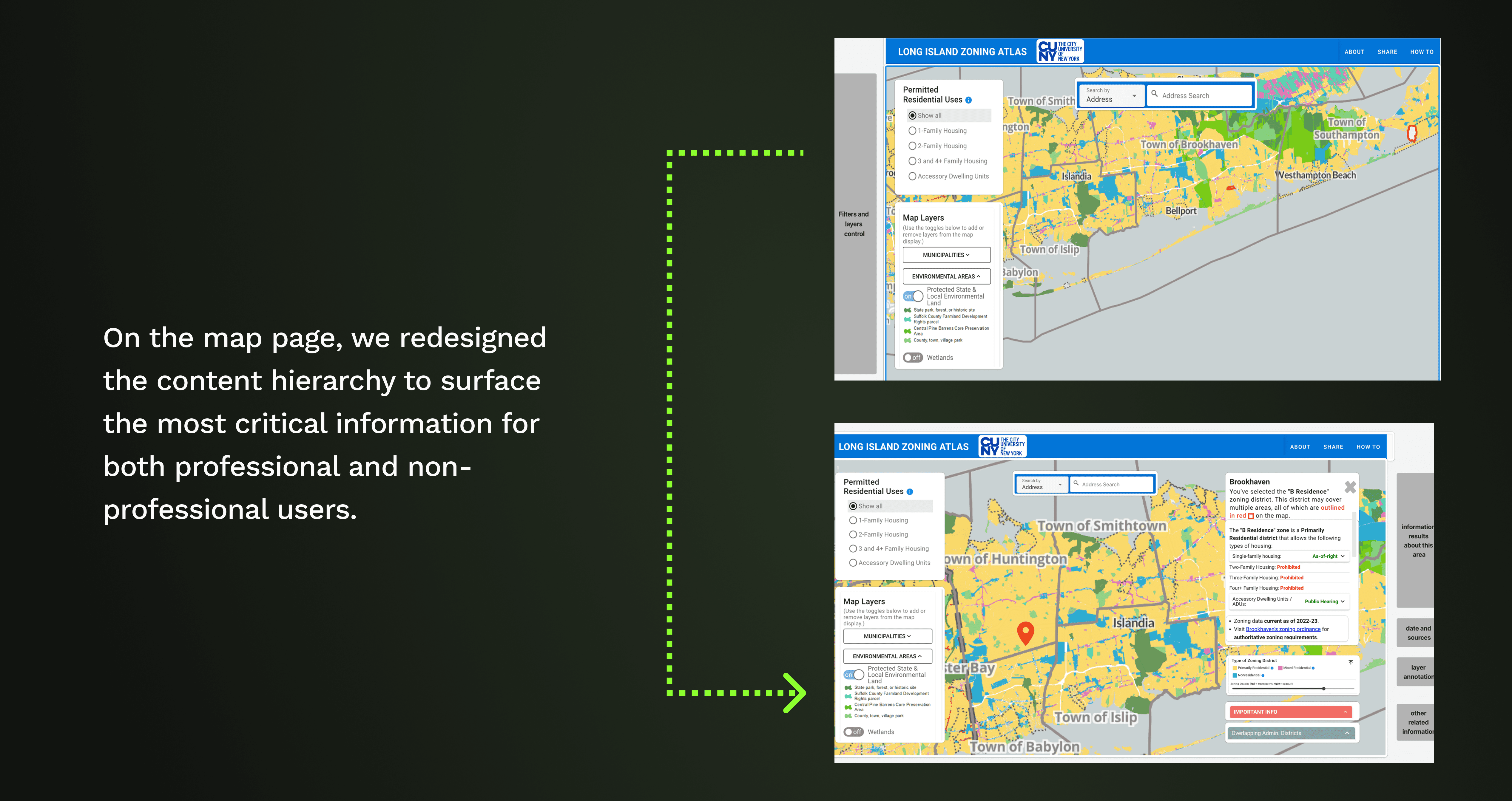
Simplified and Reorganized User Flows with Clear Tool Access:
Streamlined and clarified core user flows, ensuring each key task is intuitive and easy to complete.
Redesigned and grouped the toolbar, allowing users to easily switch zoning areas, apply filters, and access relevant tools in context.
Reduced interface complexity, making primary actions and navigation options immediately visible and lowering cognitive load.
Problem 3
Limited Discoverability:
Non-expert users struggled to find and understand relevant housing legislation, making it difficult to explore zoning information that matched their interests or needs.
Solution 3
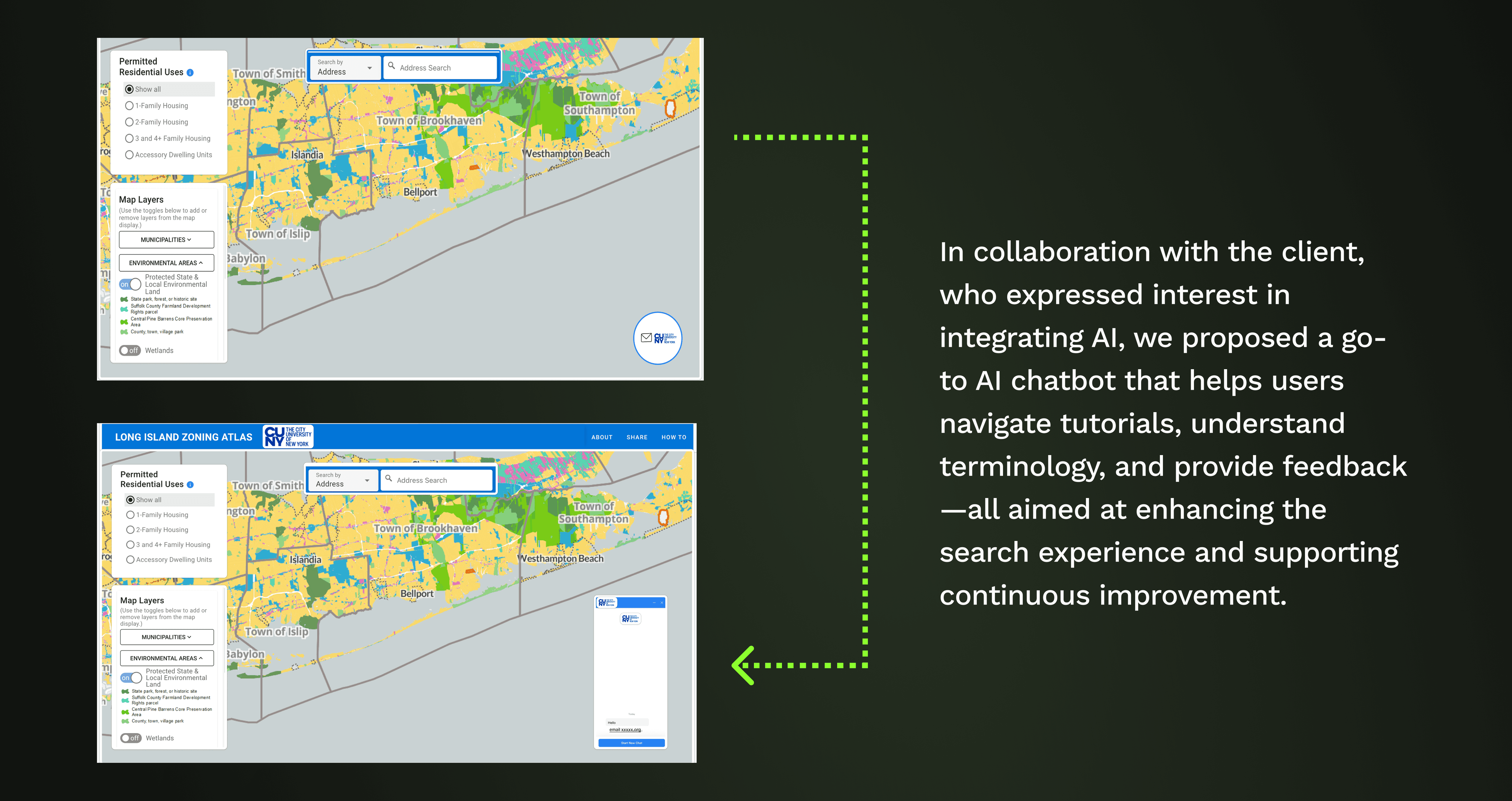
AI Chatbot for Efficient Search and Contextual Guidance:
Integrated an AI-powered chatbot to help users find zoning and housing regulations using natural language.
Enabled users to instantly get answers to specific questions, lowering barriers for non-experts.
The chatbot can read screen context and proactively offer guidance, ensuring timely support without extra effort.
Project Process
How did we get there?
Issue 1
Text Heavy 📄
The layout of pop-ups, filters, and results is confusing, with overly descriptive content.

Issue 2
Unclear CTA ❓
Users don’t know where to click or what will happen next.
Issue 3
No clear search point 🔍
Search bar is essential for most use cases, but not visible or emphasized.
User research
What we researched on?
Were these problems just our assumptions❓
To uncover how users truly perceived the Long Island Zoning Atlas, their behaviors, and their impressions, we conducted 15 moderated usability tests gathering direct insights into usability challenges and opportunities.

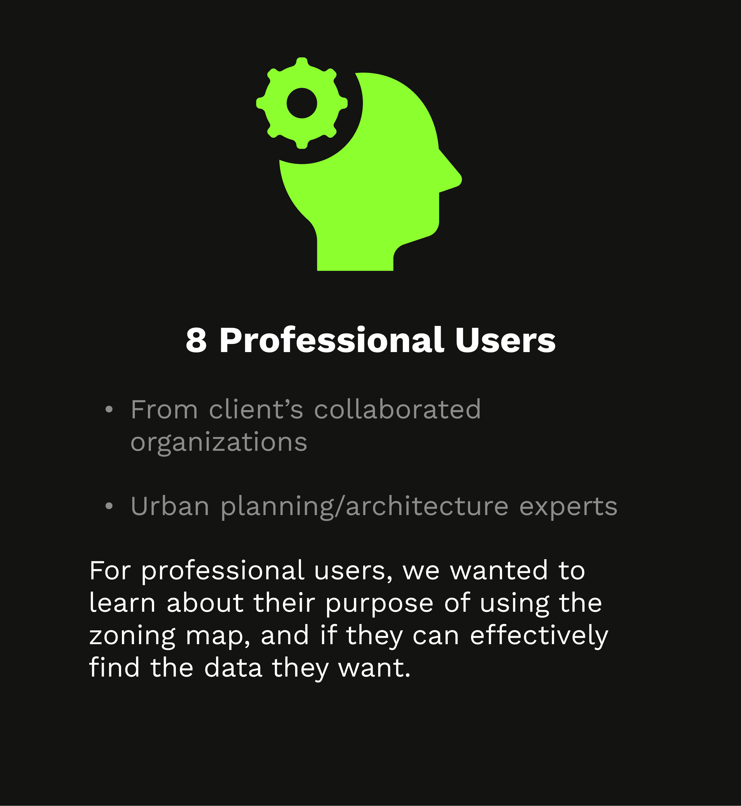
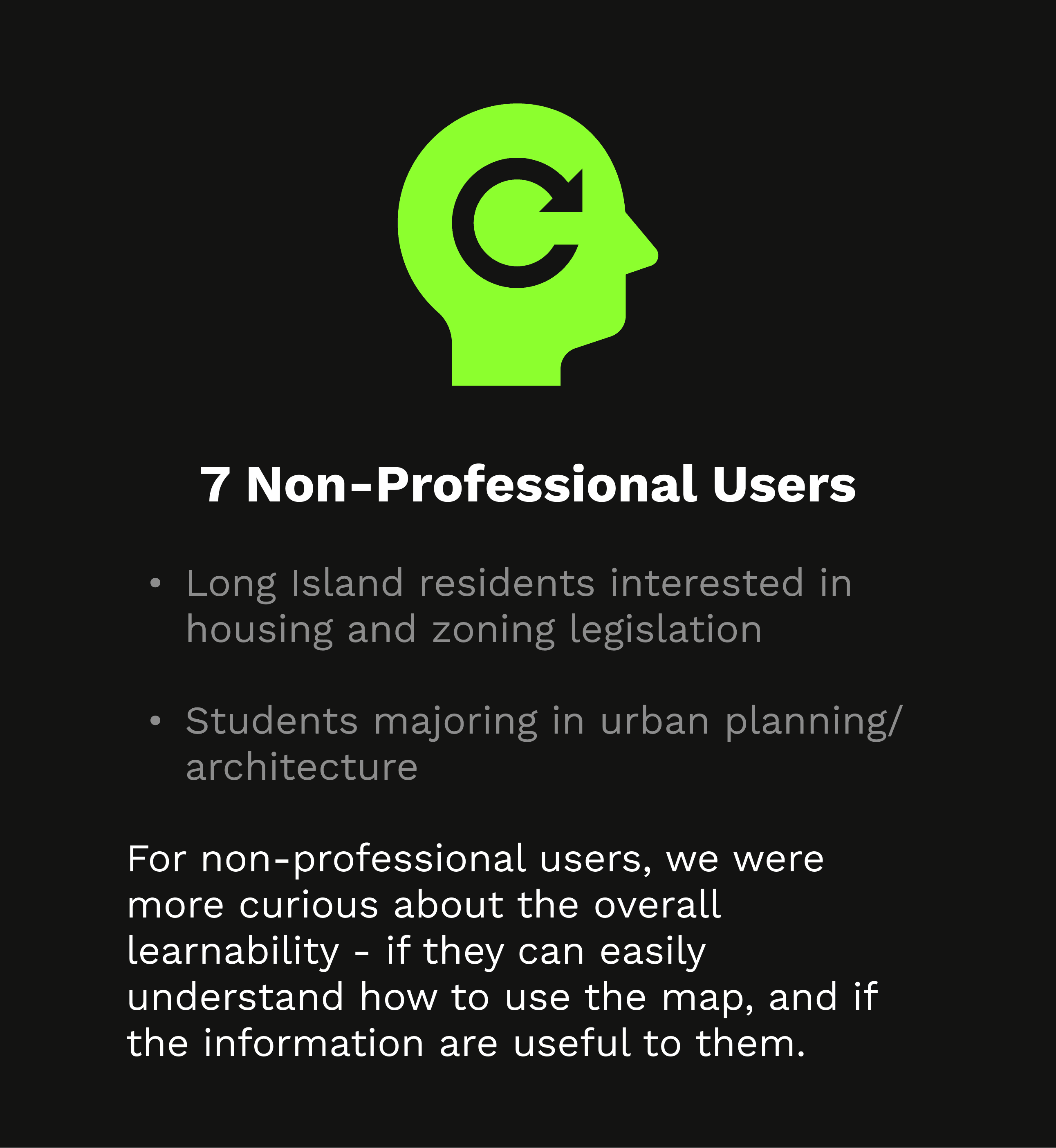
Discover two target user groups
To create a user-centered experience, we segmented target users into professionals and non-professionals, allowing us to tailor solutions to their unique motivations and challenges.
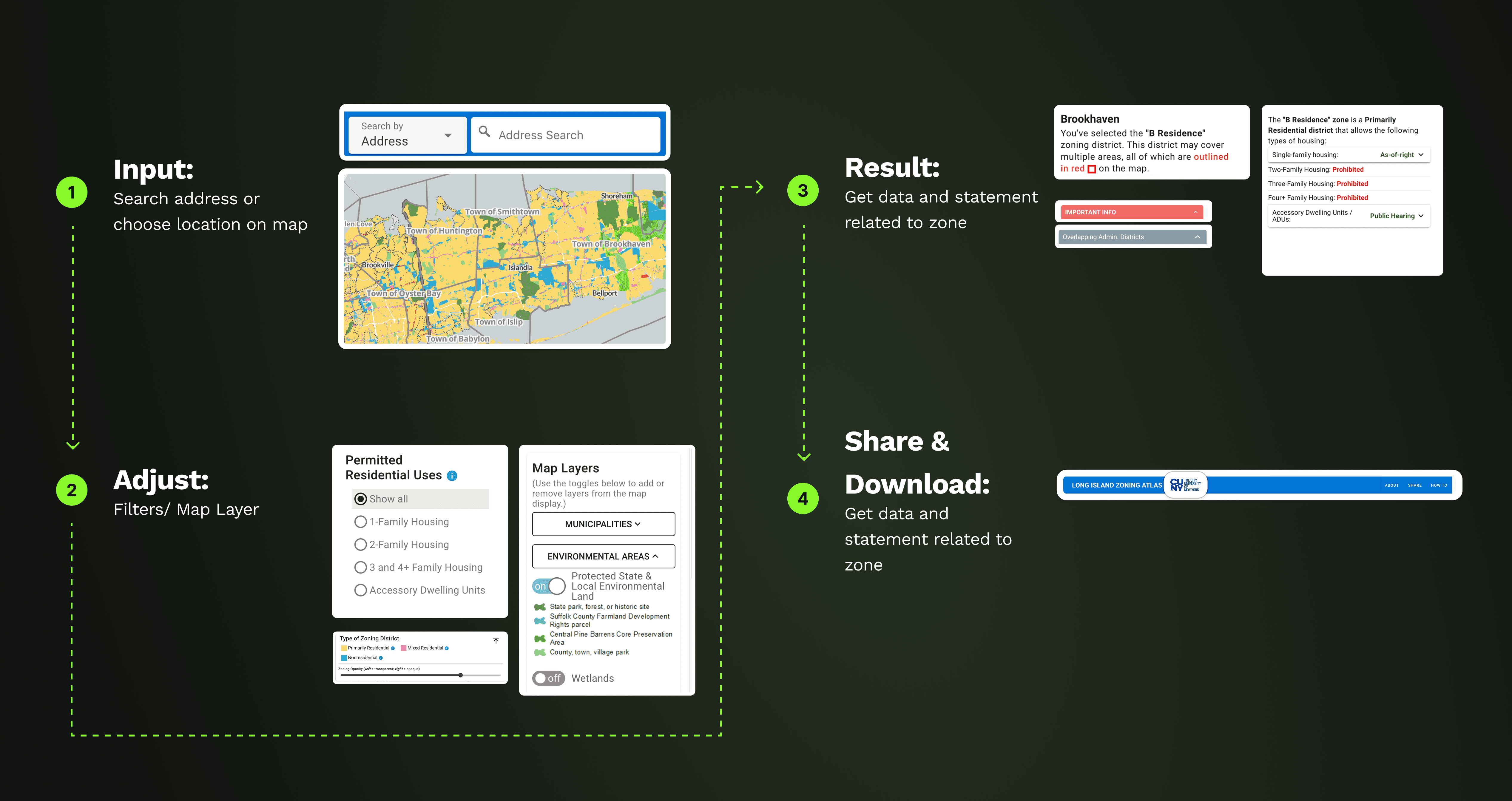
Define core user flow
We also found a core user flow that summarizes how different sections of the website work together.
What we found?
Professional users engage comfortably with the map, while non-professional users are left behind and struggle to navigate it.
Usability testing revealed striking differences between our two user groups. Professional users responded positively, finding the map valuable and easy to navigate. In contrast, non-professional users felt overwhelmed, describing the map as complex and difficult to use, and raised pain points in entirely different areas.
Problem Statement
How might we?
How might we design a map experience that balances the needs of both professionals and non-professionals, making it intuitive and useful for all audiences?
Iteration
Design Strategy & Focus Areas
Guided by user research, we clearly defined the problem space and set a focused design direction. Our strategy bridged the needs of both professionals and non-professionals by outlining tailored design principles, while ensuring a unified and inclusive platform experience.
The redesign prioritized the most critical pain points: the initial pop-up guide and the main map interface—both directly informed by research insights.
Impact
Conclusion
We received extremely positive feedback from both users and client.
Following the redesign, we conducted a second round of usability testing with 5 returning participants to validate our solutions. All three key design changes—the new landing page, improved map hierarchy, and AI chatbot concept—received positive feedback, driving the user satisfaction score to 96%. Our recommendations were well-received by the client and are now being actively implemented.
Client Comments

CUNY Mapping Service, Center for Urban Research
Client
"Designers did a great job! They understood the project well. They solicited very helpful feedback from users (a mix of professionals and non-professionals). They synthesized everything into a cogent analysis. And they went further than I expected in developing working mock-ups to show how we could implement their suggested improvements."
+0%
+0%
Task Completion
Our redesigned workflows and interface enabled users to complete key tasks faster and with fewer errors, directly improving productivity and reducing friction in their journey.
+0%
+0%
Task Completion
Our redesigned workflows and interface enabled users to complete key tasks faster and with fewer errors, directly improving productivity and reducing friction in their journey.
+0%
+0%
User Satisfaction
The new platform achieved high satisfaction scores from both professional and non-professional users, with positive feedback highlighting ease of use, visual clarity, and overall confidence in navigation.
+0%
+0%
User Satisfaction
The new platform achieved high satisfaction scores from both professional and non-professional users, with positive feedback highlighting ease of use, visual clarity, and overall confidence in navigation.
-0%
-0%
Average Task Time
Through streamlined user flows and intuitive tool placement, we significantly reduced the average time required to complete core actions, allowing users to access and apply zoning information more efficiently.
-0%
-0%
Average Task Time
Through streamlined user flows and intuitive tool placement, we significantly reduced the average time required to complete core actions, allowing users to access and apply zoning information more efficiently.
Takeaways
Alignment drives impact
Working on my first client project taught me the value of staying closely aligned with client goals to ensure meaningful outcomes. Through regular check-ins and milestone reviews—covering research plans, findings, and design proposals—we kept feedback loops tight and outcomes relevant. More importantly, we pushed beyond initial expectations by introducing ideas, like the AI chatbot, that expanded the client’s vision for the product.
Clarity of scope is key
As newcomers to zoning maps, our team quickly realized that the key to success wasn’t mastering technical zoning knowledge. It was about defining the right design scope—focusing on user behaviors, pain points, and map interactions. This clarity helped us design with purpose and ensure our solutions addressed both user needs and client objectives.
Penghao Zhu

View the full project details on the desktop version
Long Island Zoning Atlas 2.0
Redesigning Civic Data into Intuitive Interactive Maps
Background
My Role
I led the full redesign—user research, workflow mapping, prototyping, and usability testing—to make zoning data clear and useful for everyone.
Scroll down to see my process and results.
Client
Client: CUNY Mapping Service
Timeline
Mar - May 2024
Team
Penghao Zhu, Kacey Xu, Ivory Zhao, Manjot Kaur, R.Phan
Tools
Figma, FigJam, Google Form, Photoshop
Introduction
An interactive map of Long Island zoning and housing laws, built with CUNY.
Makes data easy for research and local business.
Client Goal
Make zoning data intuitive and accessible for both experts and the public.
Target Users
For professionals (planners, developers)
and the general public exploring zoning data.
Problem Statement
Zoning info was hard to find and use—too complex for most users and not accessible for all.
Design & Prototype
Before & After
Problem 1
Information Overload:
92% of users closed the text-heavy pop-up immediately, regardless of background—highlighting that the entry experience was overwhelming and not actionable.
Solution 1
Replace pop-up with a structured landing page:
Introduced a visually clear landing page with concise instructions, reducing cognitive load and building trust.
Added clear CTAs so users can either explore the map directly or access step-by-step guidance—making the entry experience more welcoming and effective.
Problem 2
Unclear Workflows and Overly Complex Interface:
Key tasks, such as finding zoning regulations or using map tools, were difficult to complete without prior experience.
The interface was cluttered and unintuitive, making it hard to distinguish functions or efficiently navigate the platform.
Solution 2
Simplified and Reorganized User Flows with Clear Tool Access:
Streamlined and clarified core user flows, ensuring each key task is intuitive and easy to complete.
Redesigned and grouped the toolbar, allowing users to easily switch zoning areas, apply filters, and access relevant tools in context.
Reduced interface complexity, making primary actions and navigation options immediately visible and lowering cognitive load.
Problem 3
Limited Discoverability:
Non-expert users struggled to find and understand relevant housing legislation, making it difficult to explore zoning information that matched their interests or needs.
Solution 3
AI Chatbot for Efficient Search and Contextual Guidance:
Integrated an AI-powered chatbot to help users find zoning and housing regulations using natural language.
Enabled users to instantly get answers to specific questions, lowering barriers for non-experts.
The chatbot can read screen context and proactively offer guidance, ensuring timely support without extra effort.
Project Process
How did we get there?
Issue 1
Text Heavy 📄
The layout of pop-ups, filters, and results is confusing, with overly descriptive content.
Issue 2
Unclear CTA ❓
Users don’t know where to click or what will happen next.
Issue 3
No clear search point 🔍
Search bar is essential for most use cases, but not visible or emphasized.
User research
What we researched on?
Were these problems just our assumptions❓
To uncover how users truly perceived the Long Island Zoning Atlas, their behaviors, and their impressions, we conducted 15 moderated usability tests gathering direct insights into usability challenges and opportunities.
Discover two target user groups
To create a user-centered experience, we segmented target users into professionals and non-professionals, allowing us to tailor solutions to their unique motivations and challenges.
Define core user flow
We also found a core user flow that summarizes how different sections of the website work together.
What we found?
Professional users engage comfortably with the map, while non-professional users are left behind and struggle to navigate it.
Usability testing revealed striking differences between our two user groups. Professional users responded positively, finding the map valuable and easy to navigate. In contrast, non-professional users felt overwhelmed, describing the map as complex and difficult to use, and raised pain points in entirely different areas.
Problem Statement
How might we?
How might we design a map experience that balances the needs of both professionals and non-professionals, making it intuitive and useful for all audiences?
Iteration
Design Strategy & Focus Areas
Guided by user research, we clearly defined the problem space and set a focused design direction. Our strategy bridged the needs of both professionals and non-professionals by outlining tailored design principles, while ensuring a unified and inclusive platform experience.
The redesign prioritized the most critical pain points: the initial pop-up guide and the main map interface—both directly informed by research insights.
Impact
Conclusion
We received extremely positive feedback from both users and client.
Following the redesign, we conducted a second round of usability testing with 5 returning participants to validate our solutions. All three key design changes—the new landing page, improved map hierarchy, and AI chatbot concept—received positive feedback, driving the user satisfaction score to 96%. Our recommendations were well-received by the client and are now being actively implemented.
Client Comments
CUNY Mapping Service, Center for Urban Research
Client
"Designers did a great job! They understood the project well. They solicited very helpful feedback from users (a mix of professionals and non-professionals). They synthesized everything into a cogent analysis. And they went further than I expected in developing working mock-ups to show how we could implement their suggested improvements."
+0%
+0%
Task Completion
Our redesigned workflows and interface enabled users to complete key tasks faster and with fewer errors, directly improving productivity and reducing friction in their journey.
+0%
+0%
User Satisfaction
The new platform achieved high satisfaction scores from both professional and non-professional users, with positive feedback highlighting ease of use, visual clarity, and overall confidence in navigation.
-0%
-0%
Average Task Time
Through streamlined user flows and intuitive tool placement, we significantly reduced the average time required to complete core actions, allowing users to access and apply zoning information more efficiently.
Takeaways
Alignment drives impact
Working on my first client project taught me the value of staying closely aligned with client goals to ensure meaningful outcomes. Through regular check-ins and milestone reviews—covering research plans, findings, and design proposals—we kept feedback loops tight and outcomes relevant. More importantly, we pushed beyond initial expectations by introducing ideas, like the AI chatbot, that expanded the client’s vision for the product.
Clarity of scope is key
As newcomers to zoning maps, our team quickly realized that the key to success wasn’t mastering technical zoning knowledge. It was about defining the right design scope—focusing on user behaviors, pain points, and map interactions. This clarity helped us design with purpose and ensure our solutions addressed both user needs and client objectives.
Penghao Zhu